SIR Model Parameters
Analysis of South Africa Covid 19 data as at 9/11/2020
(i.e. the default settings above)
With any epidemic, the two most fundamental questions the 'man in the street' would like to know are;
- what are my chances of dying?
- when will it be over?
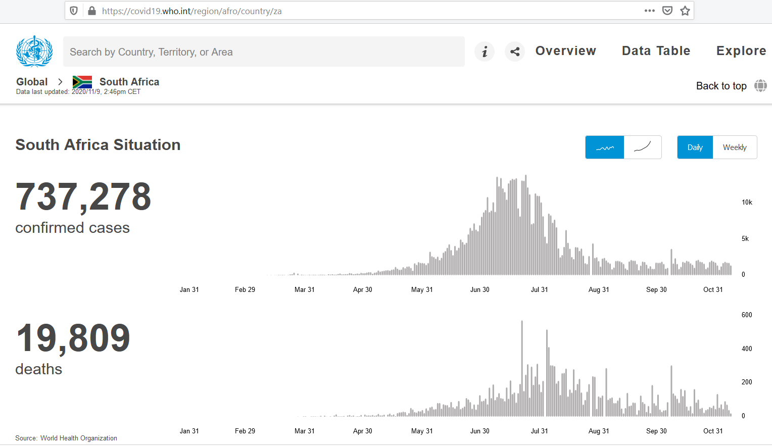
As at 9/11/2020 SA had experienced 19 809 deaths from COVID 19, however this figure is probably understated by a factor of 2.55. This is based on the ‘excess’ deaths noted by SAMRC of 48 545 up to 27 Oct (where the equivalent deaths reported on WHO were 19 008). The model traditionally has 4 inputs; population, transmission rate (β), infectious period (1/γ) and analysis period. SA’s 1st cases were reported on WHO at 5/03/2020 i.e. at time of analysis this equates to a 250 day analysis period.
Infectious period seems to be globally taken at 14 days (corresponding to prescribed isolation periods by WHO)
With SA’s population at approximately 60 million that leaves Transmission rate as the most ‘unknown’ variable. Note the product of transmission rate and infectious period equals the reproductive number (R0 = β * 1/γ) typically at 2-2.5)
By varying the transmission rate one can shift the infection peak (higher transmission rates cause an earlier peak) until it coincides with SA’s observed case peak around 27/07/2020 i.e. 137 days into the SA pandemic. This seems to occur with β = 0.21 (and R0 = 2.96). Note this peak of cases will be a lot higher than the measured cases as it is based on the entire country not just those measured.
I deviate from the standard SIR model to calculate deaths. The assumption used is that every infected individual has a (CFR * IFR/CFRratio * 1/infectious period) probability of dying.
The Case Fatality Rate (CFR) can be easily calculated from our WHO data as Deaths/Cases = 19 809/737 278 = 2.69 (at the time of analysis). The Infection Fatality Rate (IFR) will be a lot lower than the CFR because measured cases are most likely far less than actual cases as opposed to deaths going unnoticed or unattributed to COVID 19. By varying the ratio IFR/CFR one can alter the cumulative deaths to be in line with those predicted by SAMRC research i.e. 2.55 * 19 809 = 50 590. This happens at a low IFR/CFR ratio of 0.0335 which infers a low IFR of 0.09%.
This perhaps sheds some light on the 1st question however as a disclaimer I point out...
- I am not an epidemiologist or statistician
- The SIR model is very simplistic and doesn’t account for age distribution patterns of a population or spatial distributions but rather assumes them to be homogenous.
W.r.t. the 2nd question, it would be irresponsible to make any conclusions particularly considering that
 SA
is one of the few countries to have only
experienced a single distinct peak (at the time of analysis) which is typically what the SIR model describes.
A lot of countries are experiencing multiple peaks or much flatter peaks eg
SA
is one of the few countries to have only
experienced a single distinct peak (at the time of analysis) which is typically what the SIR model describes.
A lot of countries are experiencing multiple peaks or much flatter peaks eg
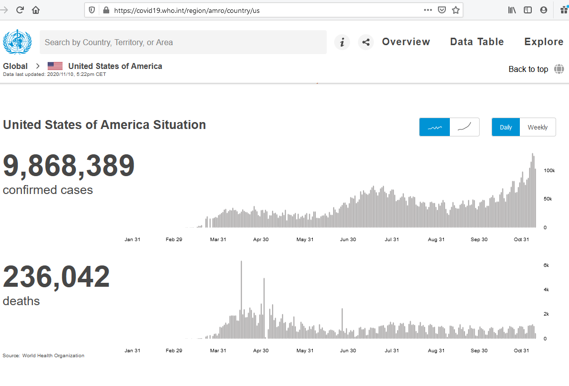 USA
which seems to be experiencing a 3rd peak.
USA
which seems to be experiencing a 3rd peak.
Update - 4 Feb 2021
SA seems to be over its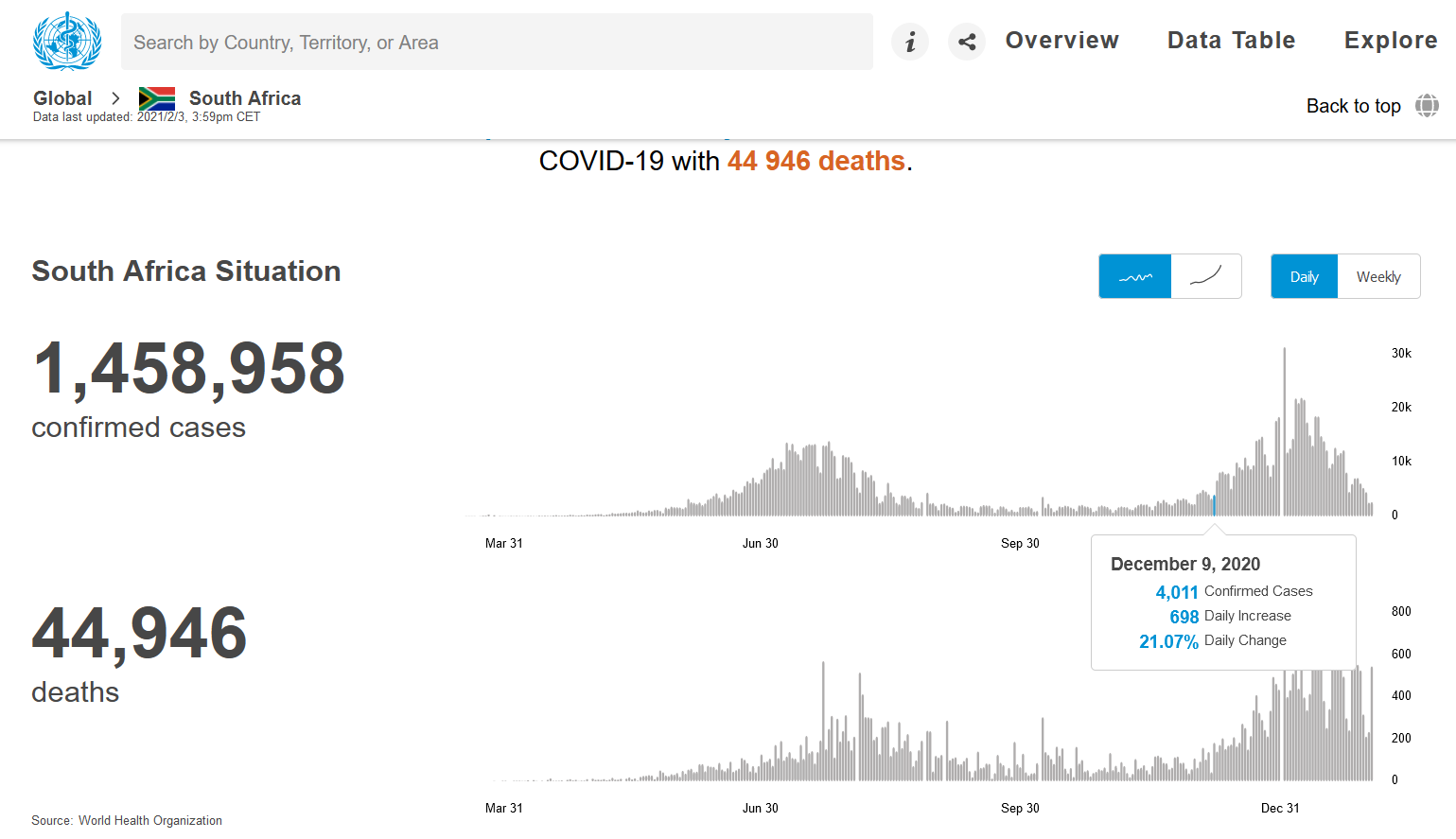 '2nd wave'
with many of level 3 lock-down restrictions being lifted as of 2/4/2021.
My analysis (and default graph) as at 9/11/2021 needs some comment...
At that stage according to the simple SIR model we should have achieved 'herd immunity'. This was clearly not the case,
one can probably speculate
'2nd wave'
with many of level 3 lock-down restrictions being lifted as of 2/4/2021.
My analysis (and default graph) as at 9/11/2021 needs some comment...
At that stage according to the simple SIR model we should have achieved 'herd immunity'. This was clearly not the case,
one can probably speculate
- The SIR model is too simple for this sort of analysis i.e. it assumes 'R' is constant over the analysis period This is not the case as behaviours change along with changing lockdown measures, and complacency
- The immunities after recovery may vary. Eg asymptomatic infections may not result in the same immunities as more severe infections
- Variants of the original strain would have to be modelled in a more complex framework
Update - 16 Nov 2021
"A main reason for poor fit with the SIR model is the wide spectrum in susceptibility. There is also a wide spectrum in infectiousness. The simple SIR herd immunity equation does not hold in this scenario. In SIR all variables are binary. You are either susceptible or you are not. With the first variant, attack rates (infections/population) in countries hardly ever exceeded 20%. As the virus became more transmissible, it opened up a bigger susceptible population. Attack rates increased with each wave. We expect the virus to become more transmissible and less deadly over time, until almost everyone had it and new infections have better outcomes." PANDA Analyst inputTechnologies utilised in this page
I was impressed with the capabilities of the graphing library, Plotly, and decided to display it using a contemporary subject. With the current popularity of Python, I opted to explore the package using this language. This created a small dilemma in that my domain i.e. the particular offering I subscribe to does not support Python. Luckily PythonAnywhere (initially used Heroku, but no longer a free offering) solved this problem for me as I was able to roll-out the 'graph app' on their PaaS and via a JSON download to my domain's server present the graph using my C# based MVC ASP.net site. Quite a rabbit hole! Possibly there was a easier way, but I may not have learnt as much :)